
Rebuilding an Educational Platform for Everyone
Role: UX design, accessibility, visual design, low to high fidelity prototyping, user testing
Timeline: June 2023 — 2026 and ongoing
Tools: Figma
Problem/Opportunity
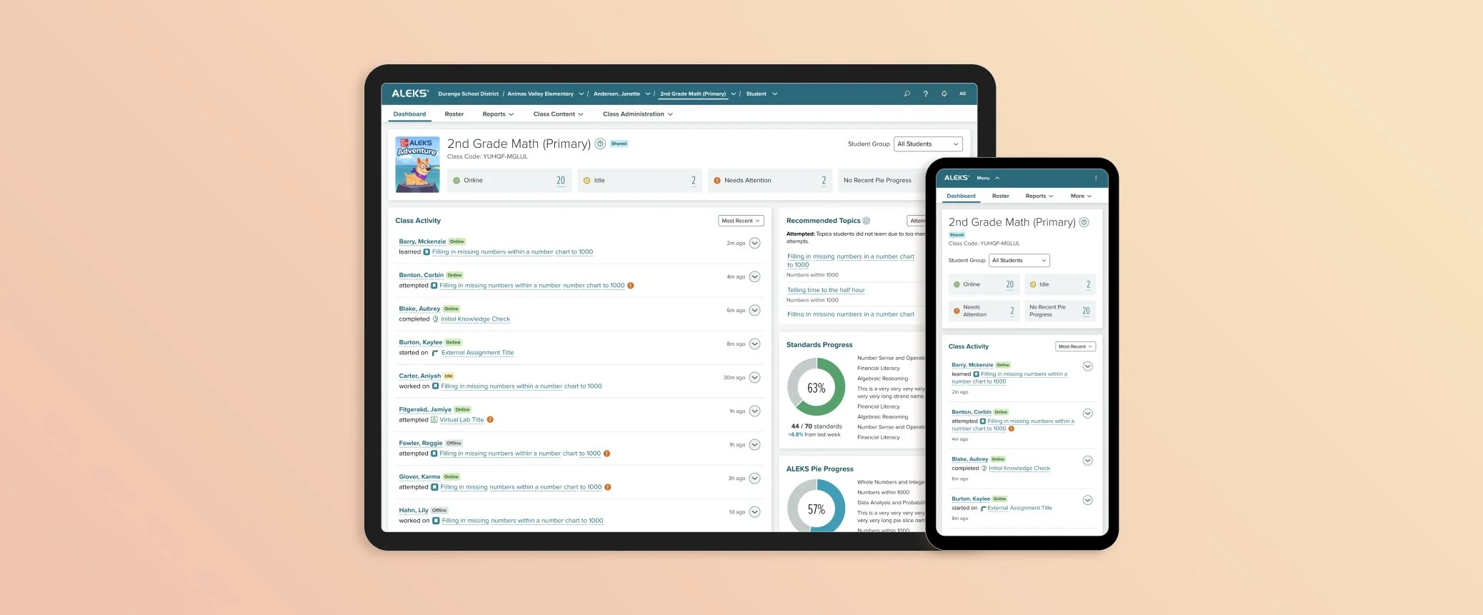
ALEKS is an adaptive learning platform used by millions of students and instructors worldwide. By 2024, it faced two critical problems: significant accessibility debt, and years of user feedback that the instructor interface was complex and difficult to learn for new users.
Rather than patch an aging system, we rebuilt the instructor platform from the ground up, with new technology, a new design system, and accessibility baked in from the start.
Project Goals
Accessibility
Make the platform WCAG 2.1 AA compliant so it's accessible to more users
Simplification
Remove unnecessary features and streamline the experience for faster onboarding and easier use
Potential Business Impact
Addressing accessibility is critical to the business. Accessibility compliance will soon be a legal requirement for school district purchases. Without compliance, ALEKS cannot be adopted by any public school district in the country, our largest customer segment.
Texas Adoption 2025: The first major state to enforce accessibility requirements for all digital products.
Nationwide rollout: Other states will follow. Within the next 2-3 years, every school district will require WCAG 2.1 AA compliance before purchasing.
Where We Started
The Classic ALEKS teacher platform, launched in 1999 and visually revamped in the 2010s, was not designed with any accessibility considerations in mind. The pages were built on older technologies and in ways that made updates for accessibility and improved design incredibly complex, time-consuming, and expensive. As the needs of our customers evolved, we saw a clear opportunity to rebuild and modernize the platform with accessibility in mind from the start.
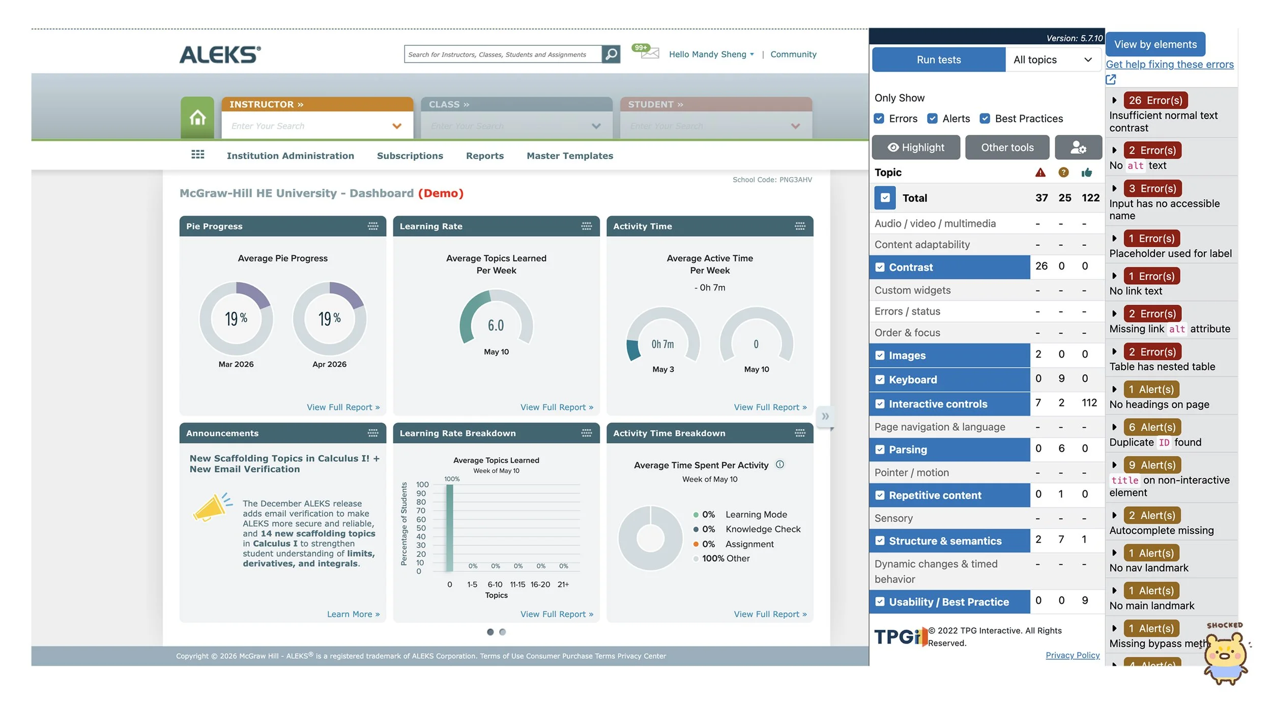
A list of accessibility issues of the existing platform called out by ARC Toolkit on a single dashboard page
The Process
1. Foundations 🏛️
I helped set UX team accessibility documentation standards, create core components, and establish global page guidelines.
2. Collaboration 🔄
I partnered with accessibility experts to conduct technical research on any new, complex designs, and brought my recommendations back to dev and product for alignment.
3. User Testing 🔍
We ran dedicated user testing sessions to uncover any friction points caused by the redesign, and iterated again based on feedback.
Outcome 1: Standardized Accessibility Specs (Shift Left)
67% of accessibility issues originate in design, and fixing them early costs significantly less than post-launch fixes. Our team needed a standardized workflow to support this shift-left approach.
However, our UX team was relatively new to addressing accessibility requirements and needed a standardized approach and clear expectations. Partnering with our Accessibility Quad (representatives from product, design, and development), I established an accessibility annotation checklist and standardized template for organizing accessibility considerations in our design files. This ensured consistency and clarity across all handoffs to development.
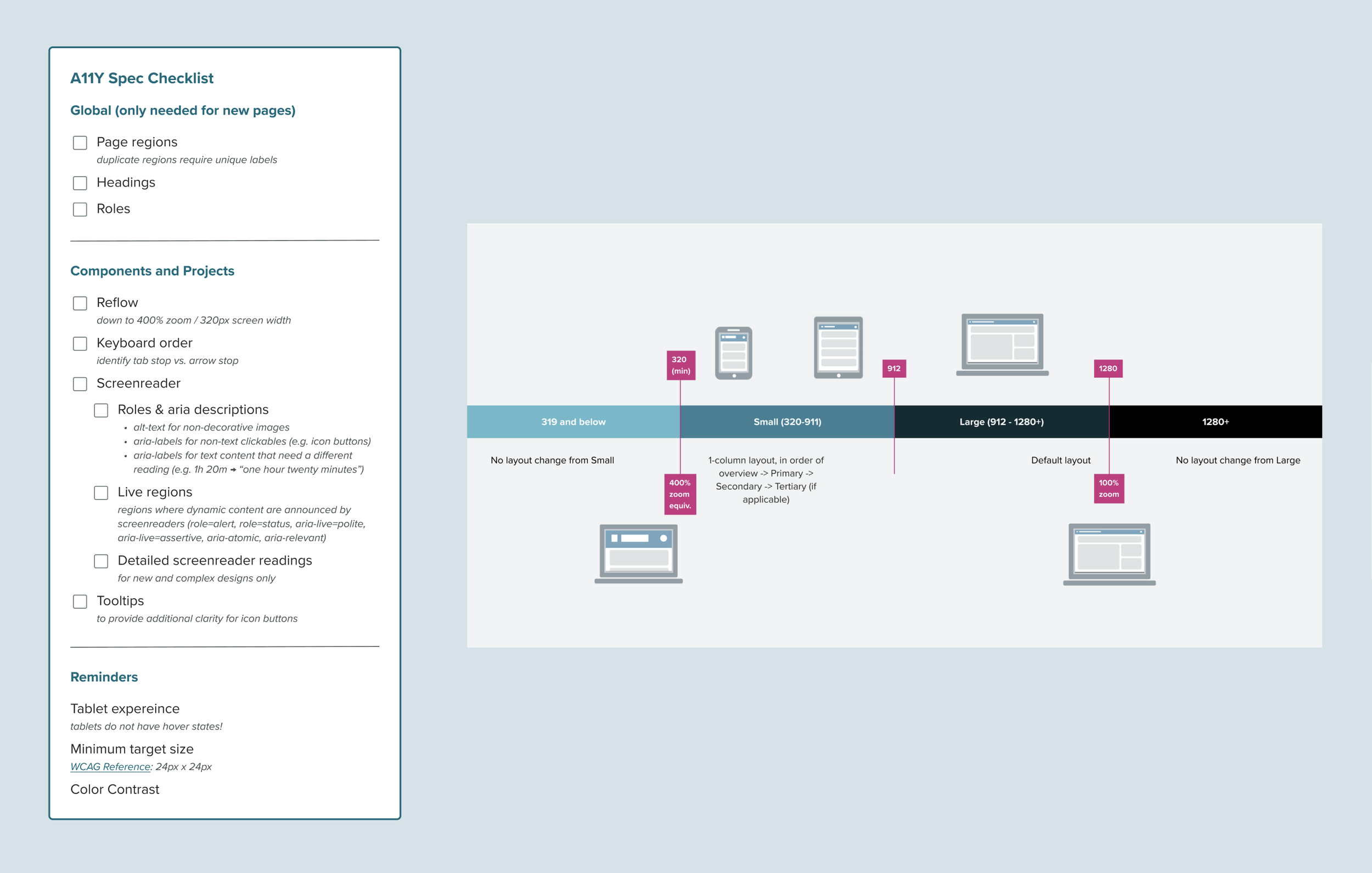
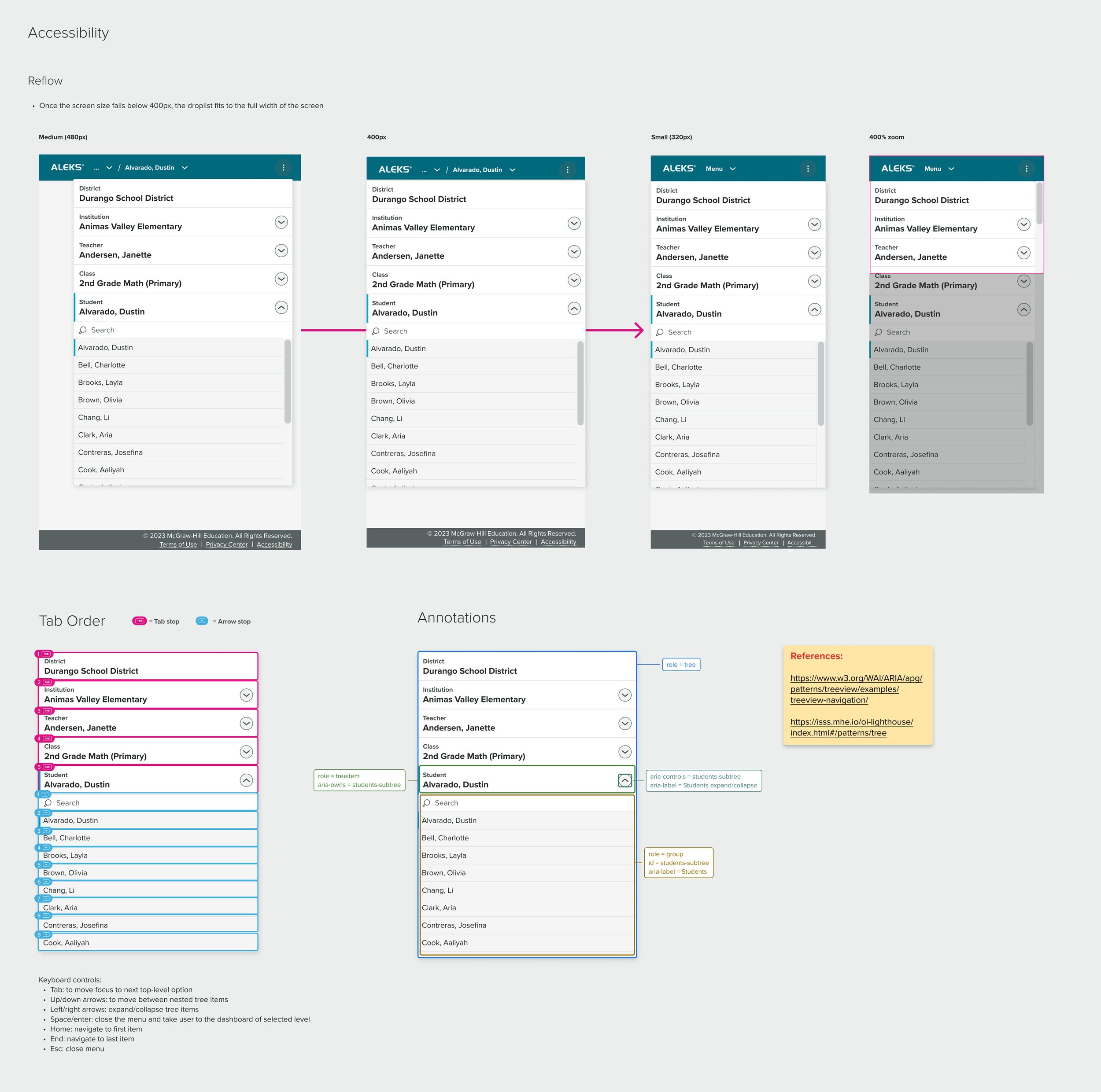
An example of some completed accessibility specifications. clearly organized by keyboard interaction, reflow behavior, ARIA roles, and screen reader output, reducing ambiguity between design and development.
Outcome 2: Simplified & Fully Responsive Dashboards
Our new dashboards are fully accessible and responsive. They feature clearer information hierarchy, proper contrast ratios, infographics with multiple visual indicators (not color alone), and seamless keyboard and screen reader support.
Accessibility requirements pushed us to be more intentional with color. We selected vibrant hues that met contrast standards while maintaining our warm, friendly brand feel, proving that accessible design and brand identity can coexist.
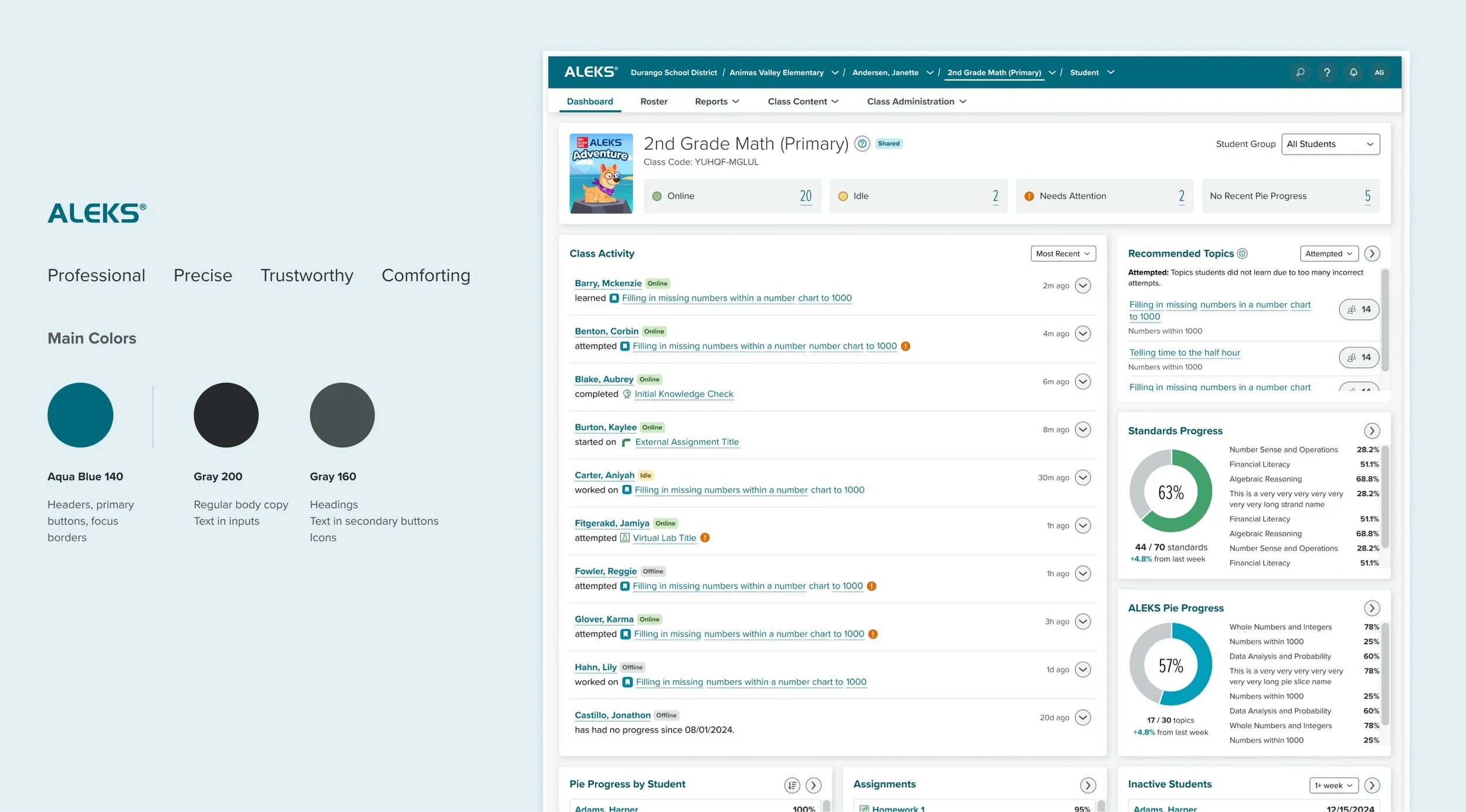
The redesigned K-12 Instructor Dashboard
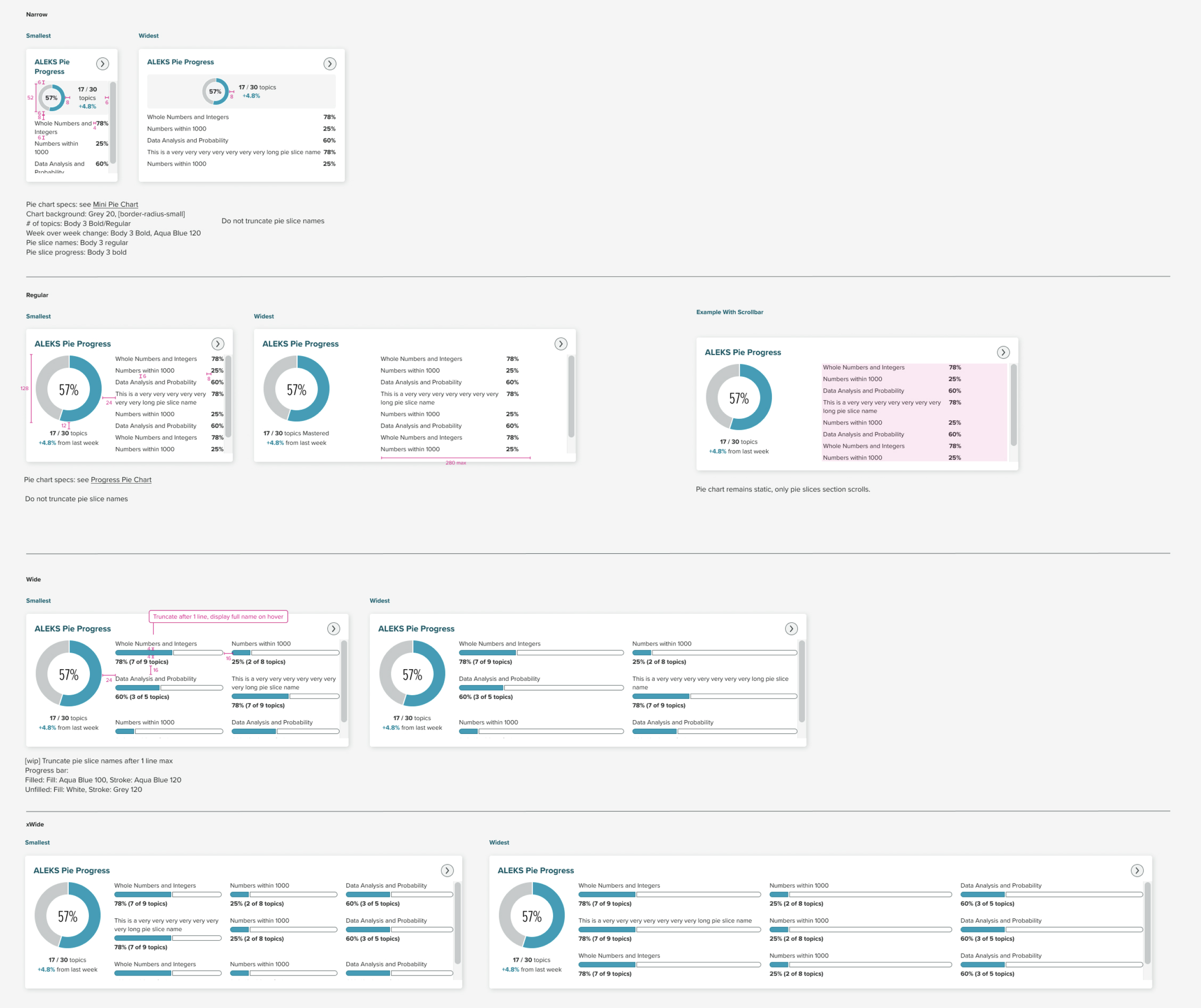
The dashboard redesign included creating a collection of fully responsive dashboard widgets so that the user could access the same information at all screen sizes without any meaning being lost:
Outcome 3: Market Differentiation
The legacy ALEKS platform served educators and administrators across both Higher Education and K-12. Over the years, it accumulated shared features that weren't tailored to the unique needs of either group. With this redesign, we're splitting the experience to give each user group a custom dashboard tailored exactly to their needs.
We started with the K-12 dashboard, and once it was released, we tested the design with Higher Education users and from there, created brand new widgets that better served their class setups.
User Research Round 1 Key Findings
For round 1, we showed the K-12 version of the dashboard as-is to Higher Education instructors to establish a baseline understanding of what needs we’re meeting, and what the gaps are.
1. Focus on entire class performance over individual students
Higher Ed classes are typically much bigger than K-12 classes. The K-12 hero widget, "Class Activity", provides a timeline of latest activies performed by each student, but Higher Ed instructors don't have the time to monitor individual student activity, and would rather know how the class is doing at a whole.
2. Focus on assignments and grades
K-12 teachers typically have students work through the default ALEKS topics, or the "ALEKS Pie", throughout the entire year. In contrast, Higher Ed instructors spent much more time creating assignments that align with their curriculum, and have each assignment count towards the students' grades.
3. Too many widgets
The K-12 dashboard, while providing better hierarchy and a cleaner interface, carried over many of the legacy widgets. Higher Ed instructors expressed that the dashboard felt cluttered with too many widgets, and that they wished to hide the ones that are not relevant.
“I have 150 students, so I don’t care what each student is working on and when, just that they are in ALEKS and getting their work done. I think most of my students are working on ALEKS at midnight.”
User Research Round 2 Key Findings
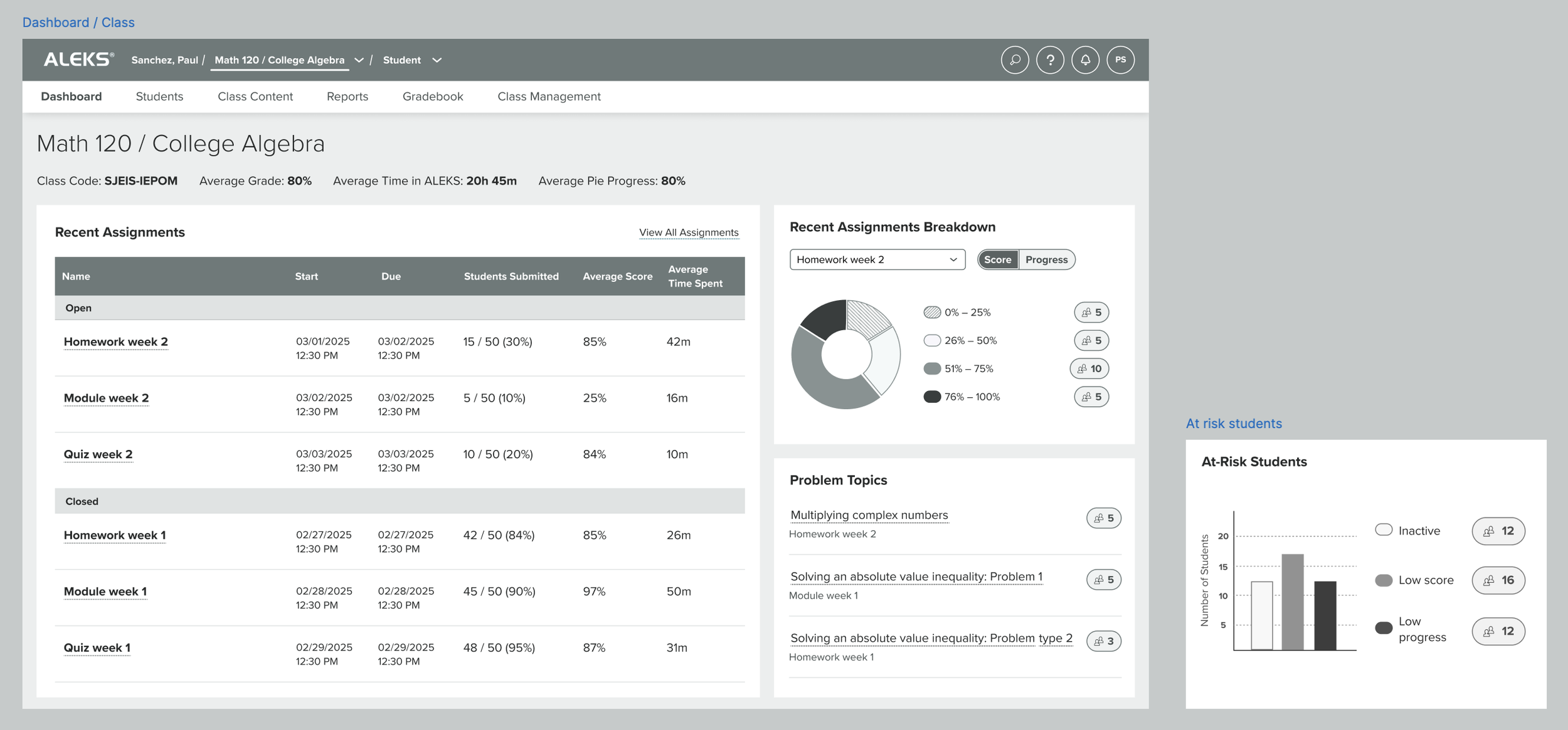
Low fidelity mockup shown to users